TL;DR
- YouTube Premium users can now test YouTube’s redesigned UI and provide feedback.
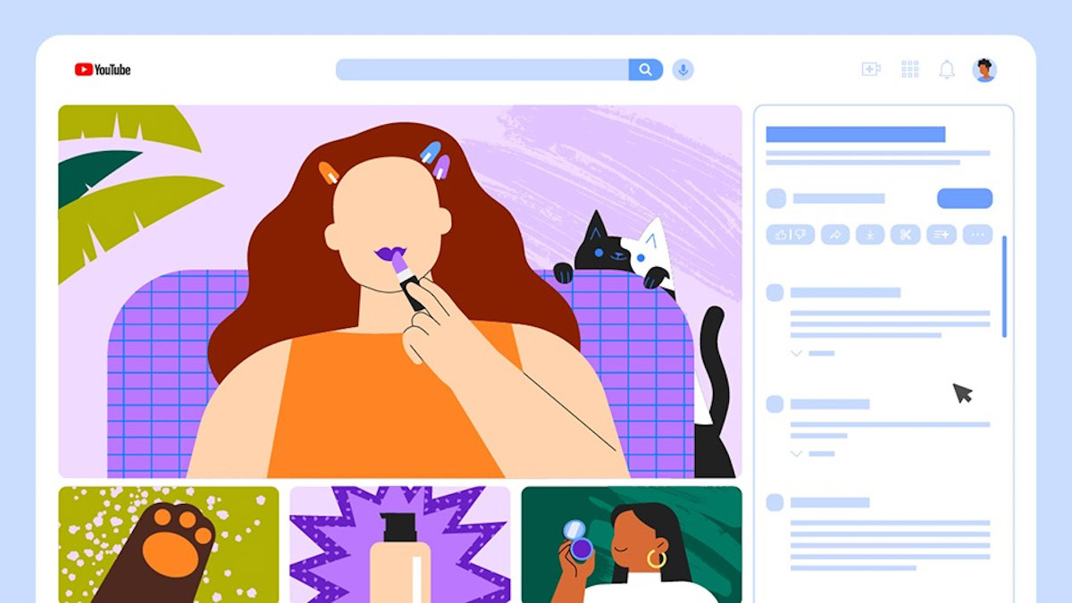
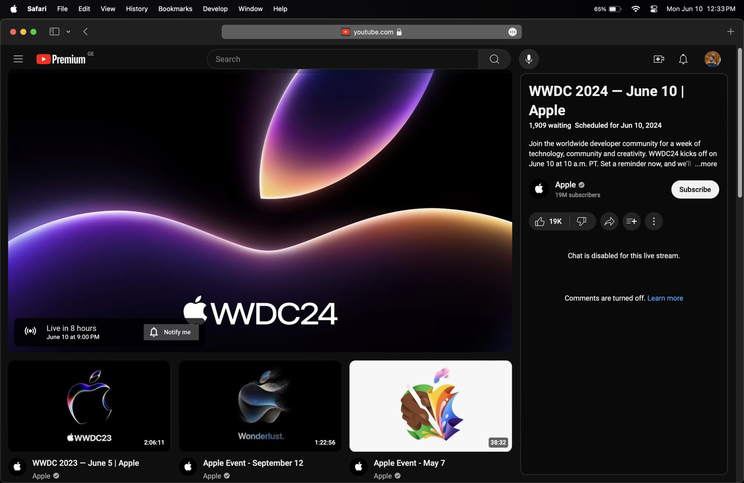
- The experimental redesign moves the title, description, and comments to the right side of the video player and recommended videos to the bottom of the video player.
YouTube is testing a redesign with desktop users, and opinion on it is divided, to put it mildly. The platform is experimenting with putting the title, description, and comments to the right of the video player rather than under it and placing video recommendations at the bottom. If you want to try this redesign out, you can pay to become a YouTube Premium subscriber and get a chance to try the experimental redesign before it goes live for all (if at all it does).
As spotted by 9to5Google, YouTube Premium’s experimental features page now lists the new “Redesigned Watch Page” as one of the features that subscribers can opt into. This redesign on desktop seemingly makes it easier to find related content but also “enhances your ability to engage with comments.”

Mahmoud Itani / Android Authority
The idea behind opening this up to more users is to provide feedback to YouTube about this redesign. This opportunity is available to Premium users until July 1, 2024. Subscribers selected for follow-up questionnaires will receive a gift card for completing the feedback study.
If you are interested in this, you can sign up for a YouTube Premium subscription and enable the redesign from the experimental features page. If you don’t like it, you can turn it off. Based on the feedback we’ve seen so far, most people seem to dislike the redesign, with many deeming it cluttered, busy, distracting, and aesthetically unpleasing.
To be clear, the redesign is an experiment, and user feedback will definitely play a role in determining if, when, and how Google will release it to the masses. We sincerely hope the new design, if it rolls out, rolls out in an opt-in fashion and stays that way.
